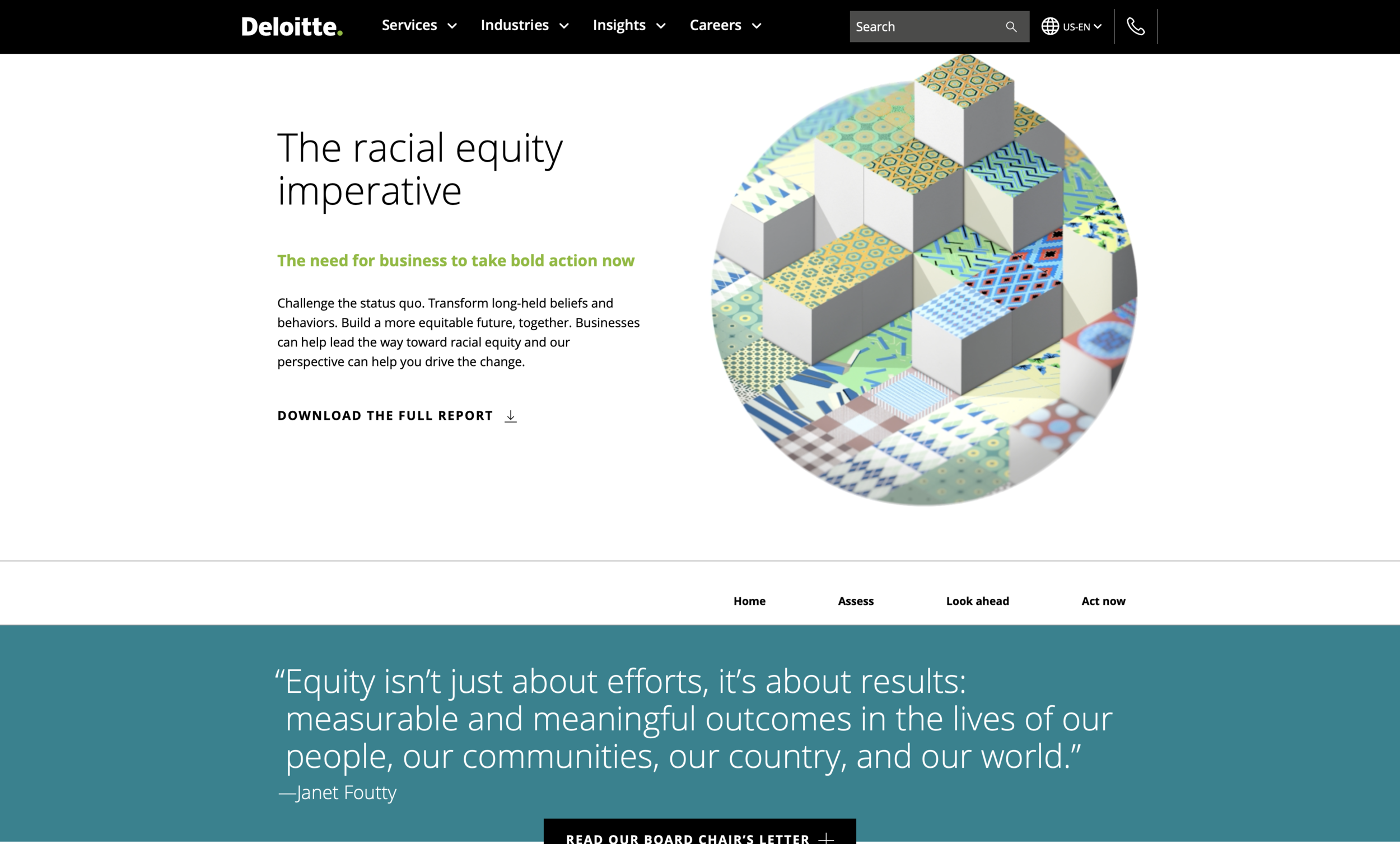
Deloitte | The Racial Equity Imperative
As a designer at Deloitte’s Green Dot Agency, I had the amazing opportunity to work on The Racial Equity Imperative report.
Purpose: Increased violence toward Black people and racial disparities, magnified by the COVID-19 pandemic, have created public momentum in addressing long-standing racial inequity in the U.S. Because of this, Deloitte wanted to work towards publishing a forward-looking report, with possible outcomes for racial equity in the next 10 to 15 years. The report seeks to identify and share the most powerful actions companies can take to drive meaningful, measurable, and sustainable change to achieve racial equity.
My primary role for this project was to design, wireframe and prototype the report’s web version, which is now live on Deloitte.com. I collaborated with Dave Portanova, Deloitte’s Green Dot Agency associate creative director, to create an effective and compelling user experience for Deloitte’s forward-looking report.
This is what you see on the page today, now let’s rewind to week one.


Visual Identity
The overall theme for the report was “cultivating equity” – enduring care, persistent action and long-term thinking. The aim was for the visual style to be different from everyday Deloitte pieces, something similar to the DEI Transparency Report or The World Remade illustrative styles. There was a heavy emphasis to not include stock photography.
A consolidated timeline of our entire visual identity is below – from initial ideas to evolving into the finished product. This process took about 10 weeks, with lots of revisions along the way. All of our creative assets and hero image concepts tied into “changing the pattern.”
The creative direction evolved from depicting patterns of people protesting to showcasing physical patterns changing across a spectrum. Near the end of the visual identity journey, the decision was made to use physical patterns to illustrate the dismantling of long-standing systems of racial injustice in the U.S. Collaboration with an illustrator resulted in hand-drawn images of these patterns, which are displayed in black and white below.
Initially, the idea was to illustrate out societal, computer or architectural systems. But, this was too complex for the client. To simplify the concept, traditional patterns and modern patterns were fused together to demonstrate transformation from one to another.
Visual identity rulesets
The breakdown of all three patterns are found below. These compose the bulk of the report – assess, look ahead, and act now. There are six root traditional patterns and those six are transformed in three ways.
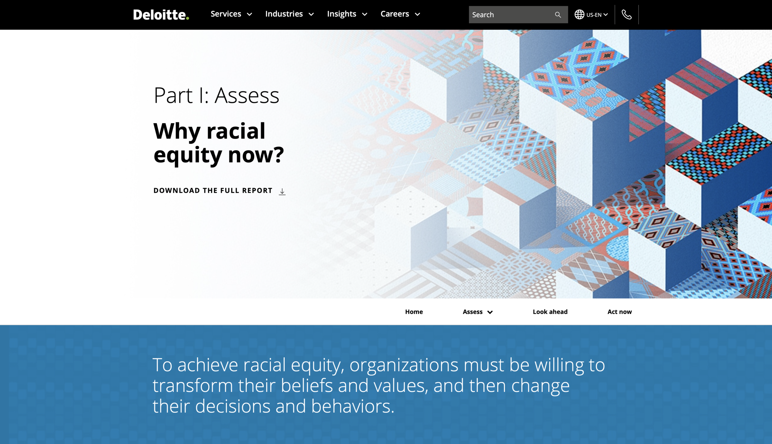
Chapter 1 – Assess: the patterns transform by zooming in. This represents seeing something new or revealing something new. Zooming in to see something in a different lens.
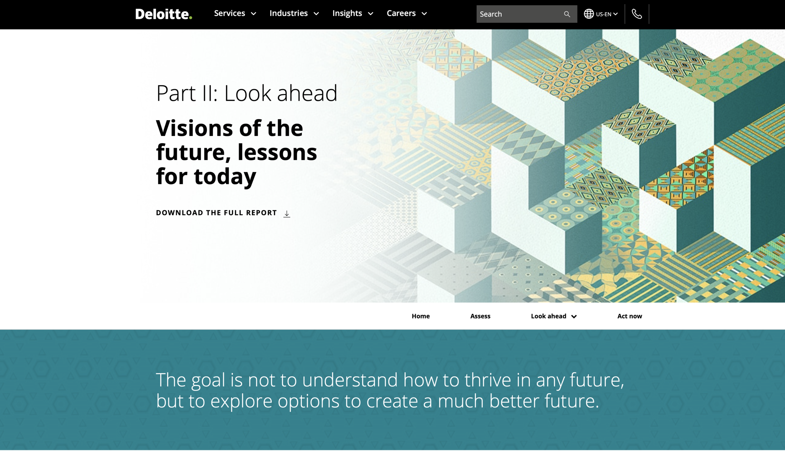
Chapter 2 – Look ahead: the patterns transform by morphing from one pattern to another. This represents learning different ways to think and changing your perspective.
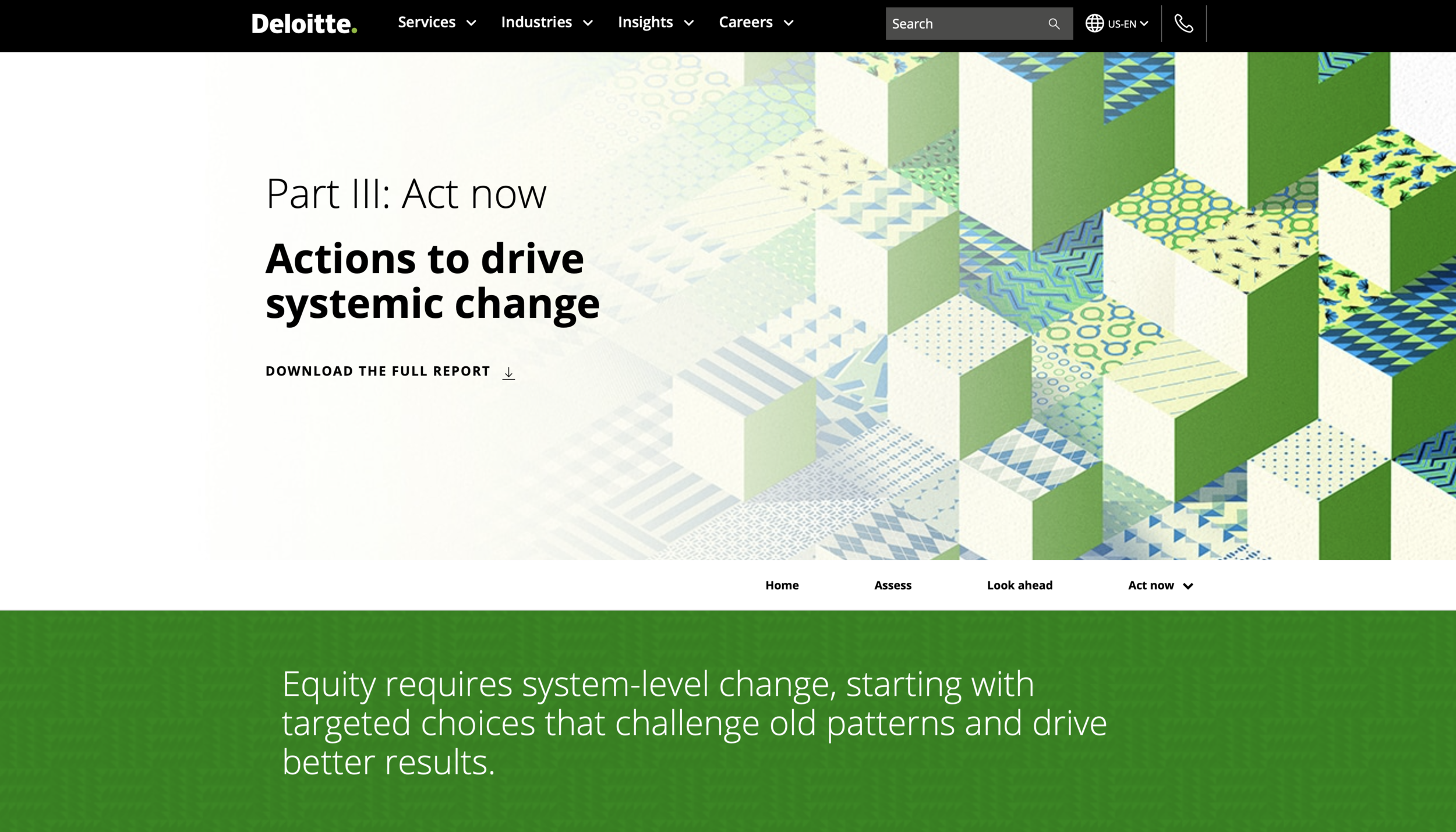
Chapter 3 – Act now: the patterns transform by dismantling. This represents seeing something completely fresh and new and breaking apart everything that you know is true to create a new perspective from scratch.
The concepts were aligned conceptually to each chapter of the report.
Wireframing
I was able to really hone into my passion for user experience design in this phase of the project!
Below is a general timeline of my main contributions – this included taking all the content provided by the practice and designing it into low- and high-fidelity wireframes.
This process started in early December but the final mobile designs weren’t submitted until late February. The goal was for the visual identity to have a completely different look and feel from the general Deloitte.com templates, necessitating much more creative thinking to develop an engaging user experience. As part of this unique user experience, we implemented a horizontal scroll effect, inspired by The 1619 Project from The New York Times.
Web experience timeline - click to enlarge
The wireframe process started when copy was received from the client in a word document. These documents ranged anywhere from 6 to 18 pages and included all the content the client wanted to be displayed on the page.
From there, Dave and I collaborated as the UX design team to create an effective and compelling user experience from the content. We then had to figure out how we wanted our users to interact with the content. This is where all the design strategy comes in–the most time consuming part.
Then, I began designing the low-fidelity wireframes, which went through several rounds of edits between the designers, writers, producers and creative director. Once final approval was received on the low-fidelity wireframes, high-fidelity comps were able to start.
The final high-fidelity comps are where each chapter’s patterns are integrated into the design. From the banner to each horizontal scroll, it was important that the visual identity was able to be pulled throughout the entire report.
Examples of each chapter’s low-fidelity wireframes and high-fidelity comps are below.
After the final high-fidelity comps were designed, they were passed them off to an outside vendor who developed all four web pages. The Green Dot Agency web developer, Jose Porras, then took their final code and integrated it onto Deloitte.com. That’s where the project you see lives today.
This project would not have been possible without our team of account + project managers, writers, designers, producers, creative directors and more. I am so grateful to be a part of this team and even more excited that this report launched on February 24, 2021!
Please take the time to read through The Racial Equity Imperative report below.


