
Deloitte Digital | Nonprofit Website Redesign
Timeframe: 3 months
Role: UX Designer
Team: I worked closely with another UX Designer, a Senior UX Designer, UX Creative Director, and team members specializing in content strategy, visual design, and engineering.
Industry: Nonprofit Federal Healthcare
Project Objective: For people living with epilepsy and their caregivers who must navigate their journey with epilepsy, this redesigned product is a unique web experience that provides accessible and personalized medical, research and lifestyle community focused content.
Over a three-month period, I led a redesign of a nonprofit website to enhance site visitor experience by making sought-after content more accessible. The original site struggled with information overload, low engagement, unclear navigation, and access barriers.
The new website addresses these challenges by:
Implementing consistent branding
Delivering relevant content tailored to user needs
Offering a modern, mobile-first experience
Within a three-person UX design team, the information architecture was restructured, and wireframes and prototypes for nine templated pages were developed. This process included extensive usability testing and affinity mapping to synthesize user data. An agile framework facilitated close collaboration with visual designers, content strategists, product managers, and developers.
*This nonprofit is a client within in the Government and Public Services practice at Deloitte, and their name may be changed or referenced differently to anonymize this project. If you have any questions, please send me an email!
Discovery Research Informing Design:
Discovery Research: The UX Research Report and Content Audit from the Discovery phase served as the cornerstone for design activities. Insights about users and their needs informed information architecture, page structure, tone of voice, and other design decisions.
Page Templates: A set of key templates were identified through the early parts of our Design phase. These templates are flexible component-based designs to accommodate a wide range of content needs across the site. 9 custom page templates were created that have defined use cases to help content authors and owners understand when to use each page template. Each page has a combination of static and dynamic components to ensure consistency across the site and flexibility for content authors and owners to update page layouts based on their content needs.
Homepage
Landing Page - Generic
Landing Page - News & Stories
Child Page - Generic
Form Template
On-Page Search - Simple
On-Page Search - Complex
Search Result Details
Search Result Details - Local Foundation
Wireframes: Initial design concepts and functionalities were created through wireframes, adhering to the set of 9 key templates above. Through all the templates, strategic decisions were made to lean heavier towards white space to allow ample room for content without overwhelming the user.
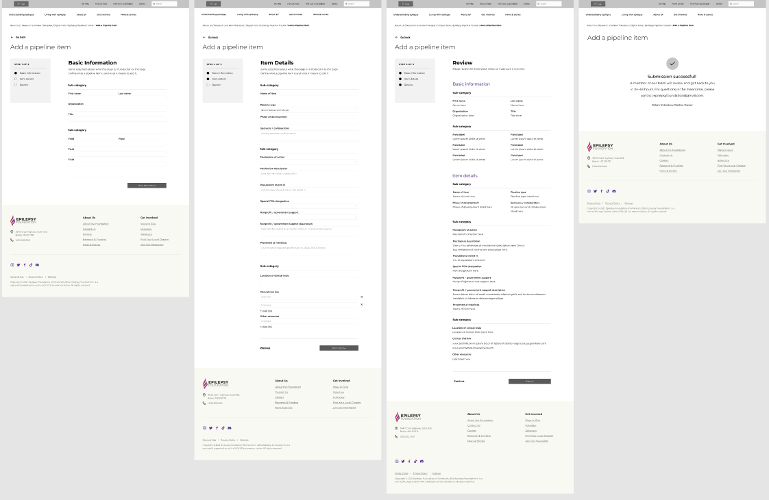
Example for Form Template wireframes
Usability Testing: Qualitative testing was conducted with five end users on prototypes to evaluate the designs of several designed templates. This revealed insights into the design’s intuitiveness, functionality, content structure, information architecture (IA) content, and enjoyability of use. These insights were then used to drive consequent design recommendations and solutions to resolve any usability challenges that were identified during testing.
Affinity Mapping: Following usability testing, a process of affinity mapping diagramming was completed to organize testing notes into high-level and low-level user sentiments. Sentiments that were expressed by a majority of the test group, or sentiments that revolve around a key UI component were highlighted and shared. Each usability challenge that was identified was accompanied with a design solution or recommendation intended to mitigate the pain point.

Handoff: Following wireframing the 9 page templates above, close collaboration with the visual design team was crucial in order to translate the low-fidelity comps into high-fidelity comps with the brand identity tied in. Throughout all sprints, consistent meetings with the development team was important to ensure dev feasibility and a smooth waterfall-style handoff.

Example for Form Template high-fidelity comps